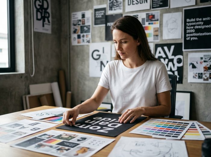
Graphic design encodes visual information before the brain starts reading. The processing of an image by the visual cortex takes a few tens of milliseconds, compared to several seconds to decipher a sentence. This cognitive asymmetry explains why visual communication dominates digital interfaces, advertising campaigns, and social networks.
Hybridization of AI and graphic design: what the European transparency label changes
Since January 2026, a transparency obligation requires labeling synthetic visuals used in advertising in Europe. This regulation directly alters the work of graphic designers who integrate generative AI tools into their creative process.
The Adobe report “State of Creativity 2025” notes a significant increase in generative AI integrations in professional workflows since mid-2025. Creative studios use these tools to accelerate the conceptualization phase, not to replace art direction. The gain lies in the rapid exploration of visual avenues, the generation of mockups, and the prototyping of compositions.
The labeling requirement changes the game: an advertising visual generated or edited by AI must now mention it. For web and social media graphic design, this means that a visual labeled “AI” does not have the same effect on trust as a fully manual creation. Brands that focus on authenticity must balance production speed and public perception.
Understanding graphic design and the power of the image requires taking into account this new regulatory layer, which redefines the codes of visual communication in Europe.
Visual fatigue in digital marketing: when static images lose attention
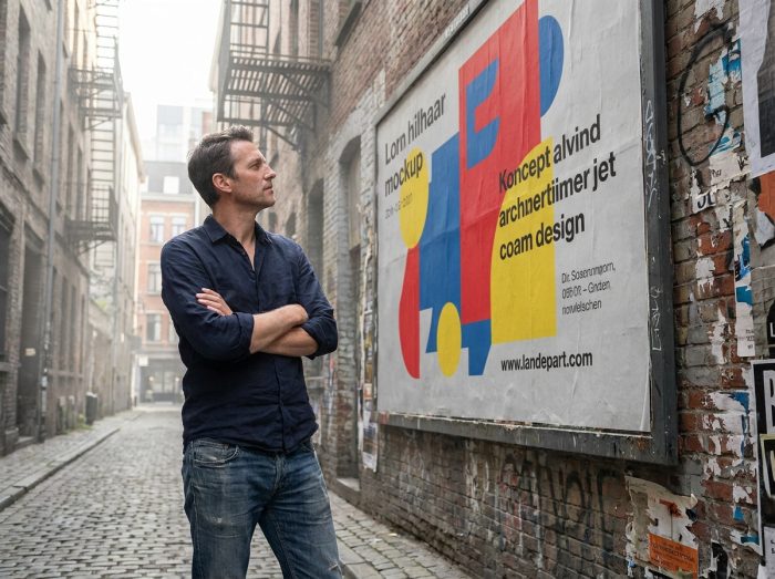
The HubSpot study “Visual Content Trends 2026” points to a decline in prolonged engagement among users exposed to more than 50% static images on TikTok and Reels. This observation drives creative teams to hybridize their visuals with motion design.
The mechanism is simple. A feed composed solely of posters or static illustrations causes attention saturation. The eye glides, the thumb scrolls. Motion design, even minimal (an animated typography, a pulsing graphic element), breaks this monotony and rekindles attention on the message.
The hybrid formats that work
- Kinetic typography: the text itself becomes visual through movement, merging the word and the image into a single stimulus
- The cinemagraph: a photograph with one moving element, creating a contrast between static and dynamic that captures the gaze
- Looped animated illustration: a vector drawing with two or three moving elements, enough to distinguish the visual from a still image in a news feed
The challenge for designers is not to animate everything, but to choose which graphic element deserves movement to convey the message. Animating a secondary detail dilutes attention. Animating the focal point concentrates it.
Influence of Japanese minimalism on European graphic design
Since 2024, minimalist styles derived from Japanese design have influenced a trend toward less cluttered visuals in Europe, according to the article “Global Design Shifts 2025” published by Creative Review. This stylistic convergence promotes what the publication calls “pure emotional impact.”
The principle is based on reducing graphic elements to the bare minimum. Where a classic European poster layers typography, photography, color blocks, and pictograms, the minimalist approach isolates a single dominant visual element. The space around this element amplifies its emotional charge.
How this cultural transfer translates into practice
European web designers are adopting compositions with more negative space. Palettes narrow down to two or three colors. Typography increases in size but decreases in the amount of displayed text. The result: interfaces and posters where the image carries the entire message, without textual support.
This evolution is not a passing trend. It responds to a concrete problem of information overload on screens. When a user sees several hundred visuals per day on their apps, a clean design stands out in contrast to the ambient noise.

Graphic design and communication: choosing between illustrating and replacing text
Every image in a communication context fulfills one of these two functions: it accompanies text or it substitutes for it. The distinction guides creative choices.
In the first case (accompanying illustration), the visual reinforces an already understandable verbal message. An infographic that synthesizes a paragraph, an icon that signals a category. The text remains the primary vehicle of information.
In the second case (substitution), the image alone carries the meaning. A signage pictogram, a logo, a poster whose graphic composition makes reading the slogan optional. This register requires a much higher level of graphic mastery, because ambiguity is not compensated for by words.
Criteria for deciding between the two approaches
- The complexity of the message: an abstract concept (security, trust, innovation) lends itself better to visual substitution than a technical, quantified piece of information
- The reading context: on mobile, in quick scrolling, the substitute image performs better; on a printed document read carefully, the accompanying illustration retains its relevance
- The target audience: a substitute visual works beyond language barriers, making it more suitable for international communication
Graphic design reaches its full power when the choice between these two registers is deliberate, not by default. An image added “for decoration” does not replace words and does not accompany them either. It occupies space without fulfilling a communicative function, which weakens the overall visual.